Can You See the Trend?
The answer is in the data collected on your network, in your applications, and the cloud. Can you see the trends, and the story that data is trying to tell? Are you able to leverage that perspective and business intelligence to make sound decisions? Of course, you can make wise decisions for your business, but those decisions are dependent upon having a current view and actionable intelligence.
Collecting volumes of data is not enough, as terabytes of information are collected the problem becomes more obscured than when you started. Automation is a useful tool where languages like Python can be leveraged to pre-format or cleanse raw data. Organizing the information into a spreadsheet is a reasonable start but, look at the spreadsheet below. The data tells a story, yet the human brain is not organized to see the numbers in rows and columns to put together the “big picture”. Sure, a pivot chart or Visual Basic macro could be written to extract specific data, but what trend to look for and where to start?
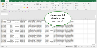
Typical Spreadsheet Example
Tools such as Tableau and Power BI make it easy to “see” the data in a form that the human mind can quickly make sense of. Humans are visual creatures and as the old cliché goes “a picture is worth a thousand words”, or in this case worth a thousand lines of your data. Visualization tools allow the user to drop a few Key Performance Indicators, measures, and dimensions onto a graph and visualize thousands of rows of data in a few seconds.
Tools can take your data like this:
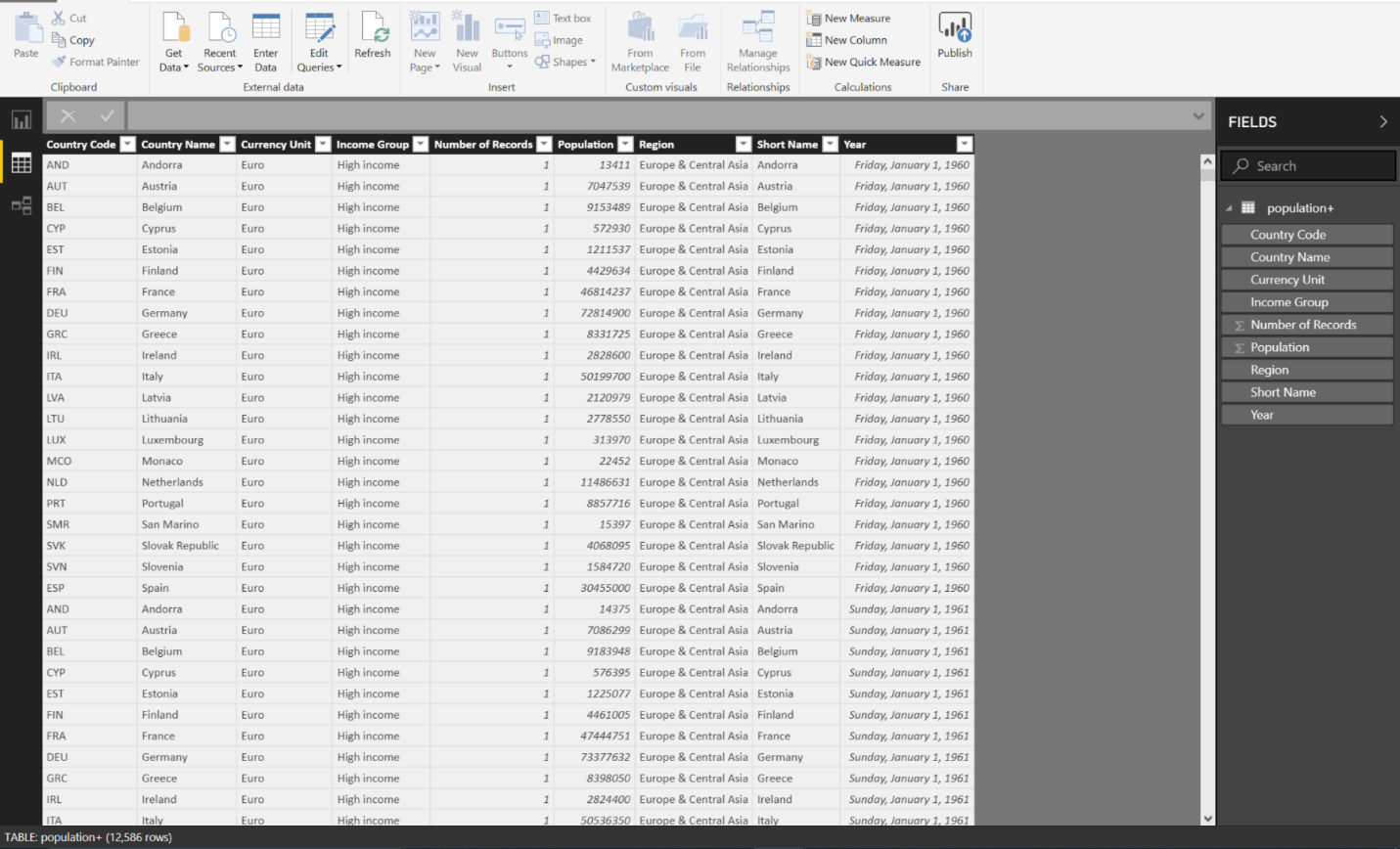
Raw Data Loaded into Power BI
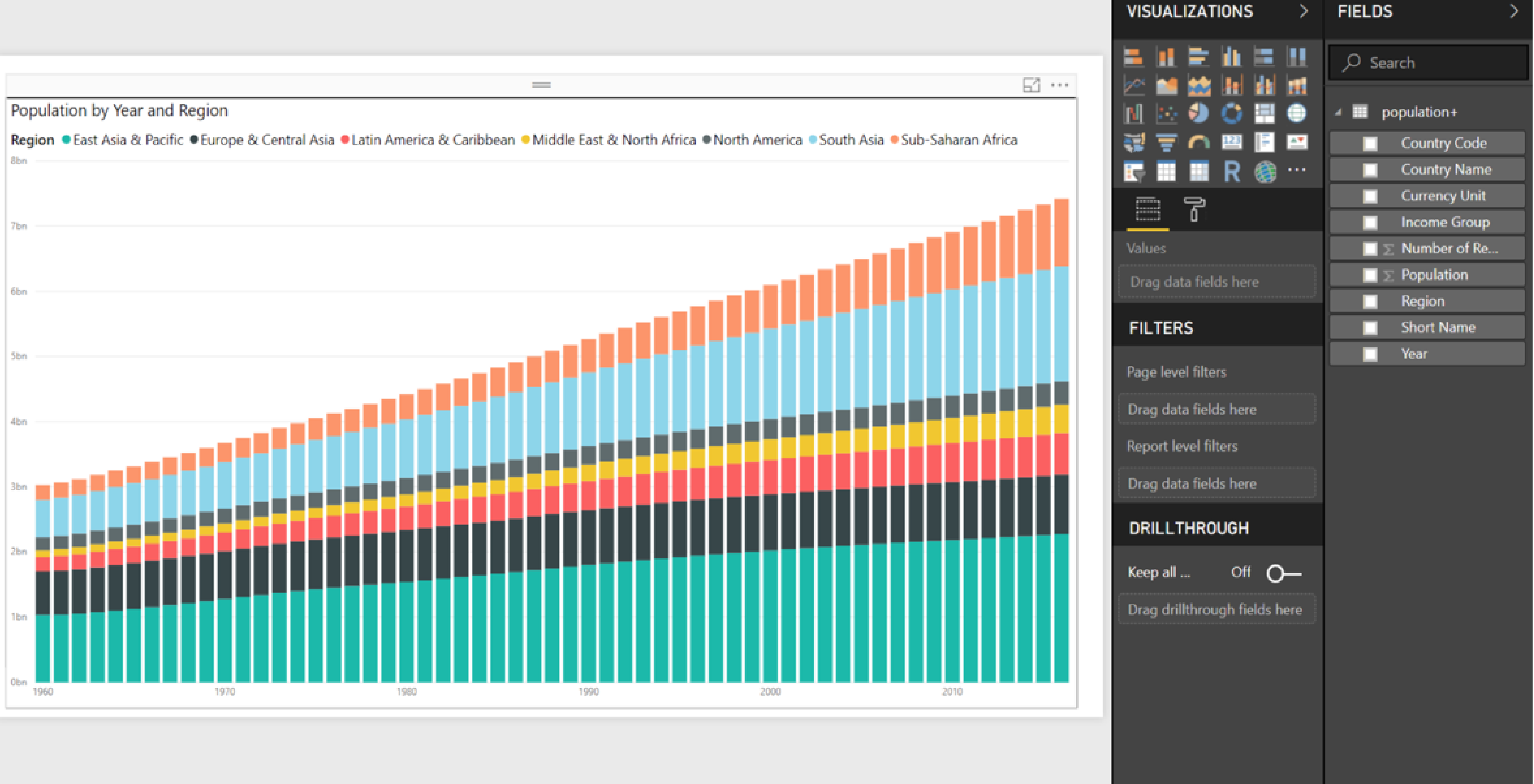
And quickly visualize the data into a more useful format like this:
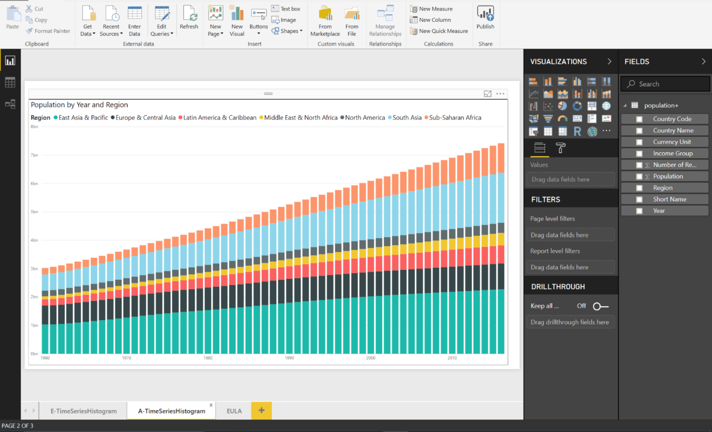
Time Series Histogram of Population in Power BI
At Award Solutions we help customers in the network operator space visualize their data using Tableau and Power BI. Instead of looking at a data feed from a network monitoring tool (and waiting for alarms to appear), the sector face with the most dropped LTE sessions immediately becomes visible on a pie chart. Rather than peg-count the number of packets over a network segment, a time series histogram chart can quickly show how the traffic is growing over time and the types of network messages that add up to the whole. Instead of guessing about LTE performance, key performance indicators such as VoLTE-Accessibility and VoLTE-Retainability can be graphed simultaneously on a line chart over time to look for anomalies and correlations.
Worried that your data resides in different formats in an SQL-database, raw text, and spreadsheets? Not a problem, visualization tools take almost any format from a web server to an internal database and combine that data together in sensible relationships. Sometimes the raw data collected from various points on your network simply doesn’t have the right granularity, or the desired perspective. Not to worry, visualization tools allow the user to calculate new tables, columns, and measurements via formulas for times when filtering out a specific type of release cause, or protocol failure isn’t readily accessible.
In business we are all asked to “do more with less” to be competitive. There are many different visualization tools available, and they all have a different cost model. At Award Solutions we leverage two different tools named Tableau and Power BI. Tableau is a great tool with many advanced features, but if does require a license subscription. Don’t have much of a budget to get started visualizing? If you have a Microsoft Office account (and who doesn’t use Word, Excel, or Power Point), then Microsoft already has you covered with Power BI Desktop included as part of the bundle. With an open developer forum, and active marketplace there are all sorts of low-cost or free resources to help the new user. So, what are you waiting for? Get out there and start visualizing!
About the Author
James Huckestein is a Technical Consultant for Award Solutions. James joined Award Solutions in 2007, and has over 21 years of experience in the wireless telecom industry. His current focus is IP Convergence, Dark Fiber, and LTE. He teaches many of the IP Networking for LTE Workshops, and the Ethernet Backhaul and Dark Fiber courses.
About Award Solutions, Inc.
Award Solutions is the trusted training partner to the world's best networks. We help companies tackle new technologies by equipping their teams with knowledge and skills. Award Solutions invests heavily in technology, research, engineering, and labs to ensure our customers make the most of their resource and network investments. Award has expertise across all technologies that touch wireless: 5G, Artificial Intelligence, Machine Learning, Network Virtualization, Data Visualization, Data Manipulation, 4G LTE, and more. To stay connected on the latest technology updates, connect with us on Twitter and LinkedIn. You can also check out all of Award Solutions' courses at https://www.awardsolutions.com/portal/.
Microsoft Power BI, July, 22, 2018, https://powerbi.microsoft.com/en-us/